
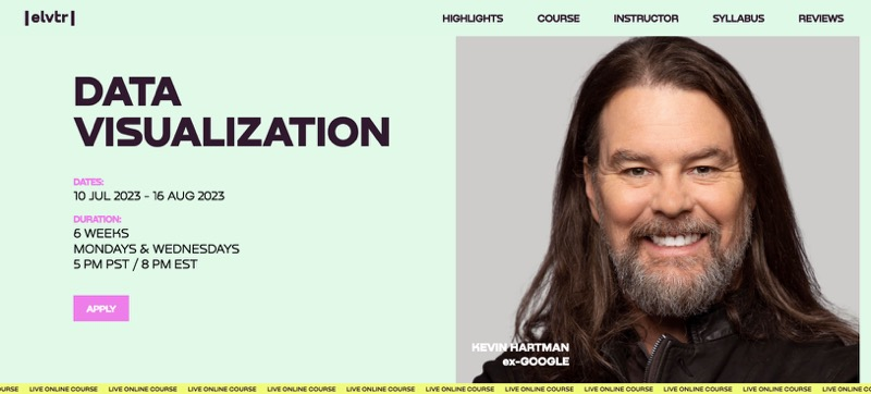
Why I decided to buy Kevin Hartman’s Dataviz course: storytelling with data
Note: this course no longer seems to be online.
It all started when I started searching for dataviz books and ended up following a few hashtags on Instagram including #dataviz. By doing this, I ended up getting an ad for the ELVTR course featuring Kevin Hartman. At the time, he was listed as the Chief Analytics Evangelist at Google which as much as it is a guru title, it is a very serious one. Most affiliates have used Google Analytics and most of us would not want to be tasked with building perhaps the most important tool in affiliate marketing.
I was nervous about spending the money on this and wondering if it I would be better off investing that money elsewhere in my company. I did do a bit of research and found someone that showcased their course certificate on LinkedIn. That was Beth Saunders who is Data & Analytics Manager at Mysa.
I reached out to her to ask for her opinion of the course if it was worth it. She only had nothing but amazing things to say about Kevin Hartman and the entire course itself.
The power of data visualization
The first few lessons of the data visualization course focus on why dataviz is important and where we can see this in our everyday working lives. What we might not be conscious of is that some of the best examples of a data driven visualization are things we share on social media like LinkedIn where that piece of content contains information and the visualization of it is why we shared it.
When you learn the dos and don’ts of complex data analysis and visualization then you quickly realize what most people do wrong including ourselves.
Perhaps the biggest mistake people make in picking the right chart or graph to have data scientists work with is picking 3D visuals that might look impressive but they have the opposite effect.
The key takeaway of this concept is your brain processes these visuals in the prefrontal cortex. You want your viewer to absorb and understand your key message almost instantly. Anything that requires the eyes to focus and constantly move around means you’ve lost the plot.
I can’t possibly give you the Coles Notes version of this lesson in a paragraph other than to say the following: this concept is perhaps the most important lesson of the course and one that could advance anybody’s career. It is that powerful. It might not be the sexiest part of the course but this is the key lesson. In the class we worked on many examples and we had homework to make improvements to existing charts.
Most affiliate software is made by people with no dataviz experience
Halfway through the course is when I realized something profound about the affiliate marketing industry. Almost all the softwares and affiliate backends that us publishers use are made by companies that don’t have any experience in creating good data visualization.
I was confident this was the case and in discussing my assignment with the course creator Kevin Hartman, he confirmed what I believed to be true. I had shown him 6 main dashboards from 6 major affiliate programs. Half of these programs had made their own custom affiliate program while the other 3 used well known platforms.
Visualizing data in affiliate dashboards
So which affiliate dashboards did I show him? They were Bet365 Partners, Buffalo Partners, Deck Media as the 3 with their own custom built software. The other 3 included software from Income Access, NetRefer and MyAffiliates.
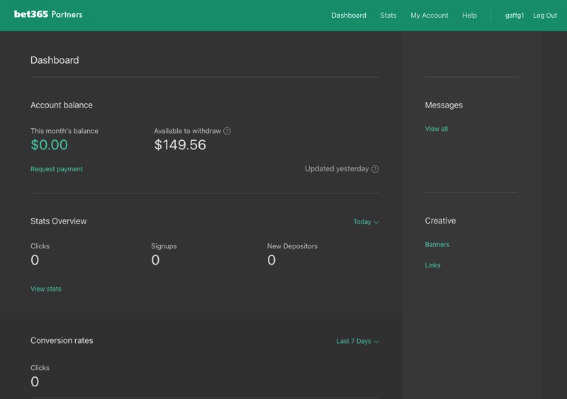
Personally I think Deck Media has one of the most advanced backends and I’m a fan of the look and UX of MyAffiliates. The 2 backends that I believe violate a lot of approaches when it comes to dataviz are Bet365 Partners and Buffalo Partners where they both feature dark backgrounds and I find it jarring to view data on their reports and charts.
Kevin shared in a podcast I did with him that these dashboards are well designed and very attractive, they just fail to tell a story with your own data beyond the basics.
Data visualization tools
In the course for Data Visualization with Kevin Hartman, he allows you to use whatever data visualization tools you want to use. He encourages people to pick whichever tool they prefer and describes the pros and cons of each.
The main tools discussed in the course are as follows:
- Tableau
- Power BI
- RStudio
- Excel
The one tool that wasn’t discussed much was Google Data Studio which has now been packaged as Looker Studio. That said we’ll look at these 4 tools and also give a quick overview of Looker as well.
Tableau
I choose to use Tableau mostly because I was feeling lazy and not sure I wanted to do a deep dive into Python. If you are into programming languages then you would want to consider RStudio with Python. Otherwise Tableau has a cloud version of their app that you can use for free and it seemed to be the most popular tools used amongst my classmates.
Pros
- Has a free cloud version called Tableau Public
- Lots of YouTube tutorials to get started
- Probably the easiest dataviz tool to learn
- Will look good on your resume
- Very easy to get started using excel, csv or Google Sheets files
Cons
- The paid version is not as cheap where you have to pay $70/month billed annually
Power BI
When sharing some of our work in the class discussions, Power BI was rarely seen. It isn’t to say it isn’t a good software, if anything it has a solid reputation as good as Tableau. It goes without saying, Power BI works with Microsoft Excel but you can still use CSV files.
Pros
- Reasonably priced at $10/month
- Lots of documentation online
- A common tool taught in data analytics courses
Cons
- Steep learning curve
- Not the best user interface
R & RStudio
When I learned about R and RStudio, I was both excited and scared. Scared because it was as close to programming as you can get in the dataviz world. I personally believe that R might be the most powerful data visualization tool that exists but most professionals will gravitate towards Tableau or Power BI.
I tried to get started with R but I was struggling to install it on my computer, so I panicked and went to Tableau immediately.
Pros
- Free and open source
- Perhaps the most powerful BI and data visualization tool that exists
Cons
- Steep learning curve
Looker Studio
There are many people in the search engine optimization industry that got very comfortable using Google Data Studio. It was free to use and technically it remains free in the sense that you can connect with other Google products without having to pay. As soon as you import data sources outside of the Google ecosystem, then the pricing comes into play.
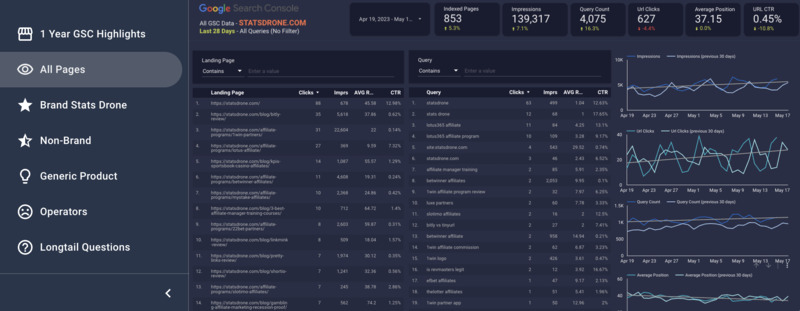
PS Thanks to Martin McGarry from searchassistance.co.uk for setting me up with this lovely dashboard with Looker Studio.
Pros
- Connects with numerous Google products including Google Sheets, Google Analytics, Google Search Console
Cons
- Doesn’t seem to be well utilized in the data science and data visualization world
- Might not be the skill on your resume that will standout vs Tableau
How has my outlook changed on data analytics and data science
Halfway through the course, I wanted to see what kind of people in the world of affiliate marketing were actually paying attention to big data. I started doing various LinkedIn searches to find roles related to data analysts, data analytics, business intelligence, data science, data visualization and more. I started to look at prominent companies in affiliate marketing and was shocked that most of the major affiliate networks and affiliate softwares didn’t have these people in their organization.
Life after the course is very different. I’m very excited to invest more time into learning more about all aspects of data. This course gave me a greater appreciate for my programming team that ironically enough, works on our StatsDrone data tool for affiliate marketers. I know we made some mistakes in the past on choices of databases and methods of obtaining data, but data is simply everywhere we look. It is hard to not have a data without Google Sheets opened. I’ve been learning more Excel shortcuts along the way so I can process data without having to manually manipulate MySQL files.
New bar charts
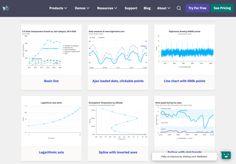
I’m now obsessed with reports, bar charts and anything to visualize data. Our stats app had no charts or graphs of any kind and it was one of the first projects we actioned after. Sadly I was very hopeful of being able to use D3.js but I got the impression that D3 needed work to get it working for my needs. Therefore we switched to HighCharts which includes pie charts, line charts, a very types of bar chart formats and visual elements.
Data analysts are everywhere
I’m using a service called Riipen and on this I have 3 jobs posted: one for data analytics, one for SEO and one for sales and marketing. The SEO and sales jobs get almost no applications whereas the ones associated with data analytics are getting about 2 applications per week for the past 2 years non-stop.
Data analysis in affiliate marketing
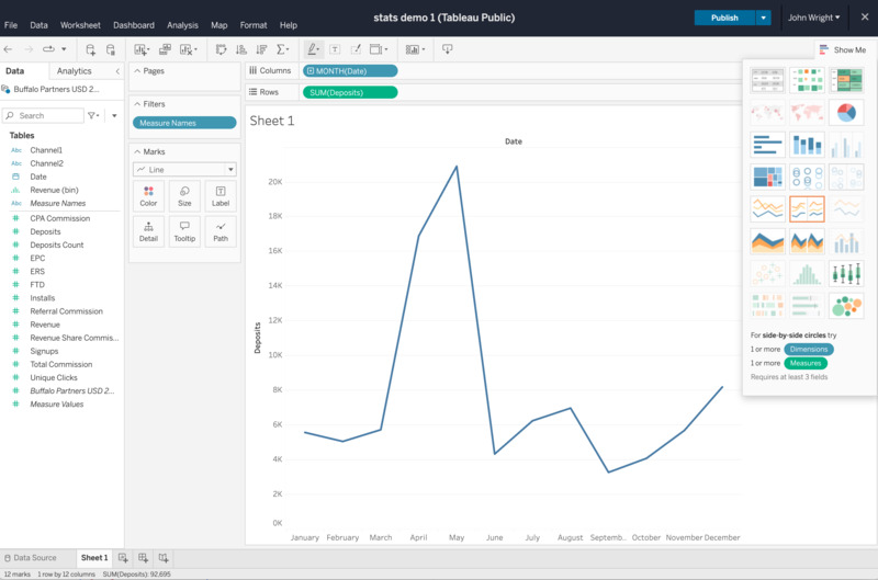
In this data course I got to choose between running analysis on the Chicago bike share system called Divvy or use my own project. I chose to do my own project and decided to analyze one affiliate program with 2 years of data.
I had to prepare data which was technically not too difficult to do but it took some work. It turns out, the StatsDrone app made life easier for analyzing data. The app collects data through scraping with username and password or it will pull data through API. The datasets are stored in a database which can be easily exported as a CSV file. I exported the CSV and I was able to import this into Tableau very easily.
It probably took me no more than 10 minutes to start playing with these data sets and creating visual representations of these affiliate stats.
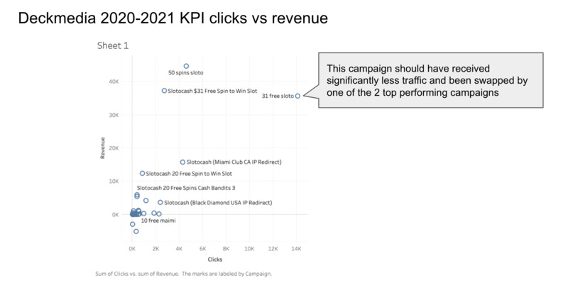
Now if you want to talk about data storytelling then we certainly got it with this data set which covered 2020 to end of 2021. With the various ways Tableau can provide you with information visualization, you can make data come to life. You can use scatter plots, area charts, a pie chart, bar graph, statistical graphics and other tools to identify patterns and understand data.
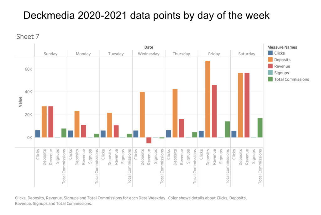
You can see the data visualizations in the present data and looking at the data points you start to gain insights. Tools like Tableau more or less can make you a data analyst by making it easier to spot the patterns. These skills certainly can help with predictive analytics and map your key performance indicators aka KPIs.
Why I think this course will help you become a data scientist?
- Kevin Hartman is very passionate about his work and he is a leading expert in data visualization theory
- The course is suited for any level of skillsets including beginners
- You’ll learn the tools for better communication skills and be able to make better data driven decisions
- No programming language skills needed
What is the future of data and data visualizations?
You know I’m going to start talking about artificial intelligence and machine learning. However AI & ML have no use when you don’t have good data sources to work with. You need clean and filtered data sources so you can create compelling data visualizations. It is tools like Tableau and Power BI that is what data visualization tools provide.
10% discount for the course
Use this link to Kevin Hartman’s ELVTR Data Visualization course to get 10% off, just use bonus code ABI.